Hello residents of Scoville! With this entry, I’m continuing our look through the sketches and concepts that make up the (current) art of Doomsday Peppers. So, if you’re just joining us, feel free to go back to part one of this topic. Don’t worry, we’ll wait here. You won’t miss anything.
You good? …All caught up? Great!
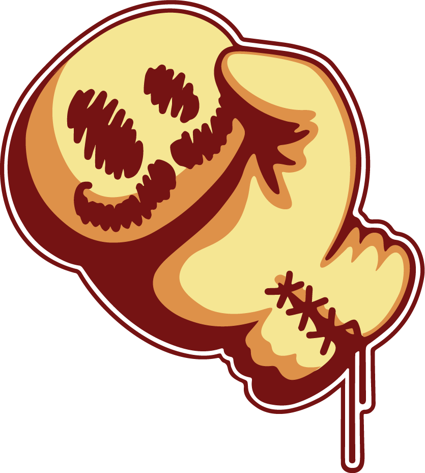
Last time, we left off with the original and revised Hero Images for the landing page. If you remember, one thing that was added in the revision was a menacing looking pepper looming over the logo. I promised you more about that idea, so let’s start with taking a closer look at the concepts behind them.
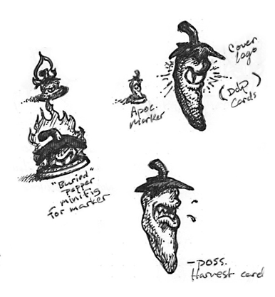
Here’s a better look at these little guys. As revisions were made and the peppers became more and more an actual force of evil in the game, I started wandering if they needed a little more personality, so the anthropomorphic peppers showed up in my sketchbook (not to mention there were several playtesters <ahem> who were very disappointed that there were no cute little peppers in the game). So far, the logo is their only in-game appearance, but I’d love to see them pop up here and there in other artwork for the game What do you think?
Before diving too deeply into the art for other elements, card layout & designs will be the first focus. Coming from a graphic design and illustration background, this was an appealing challenge for me, since it’s such a great combination of the two disciplines.
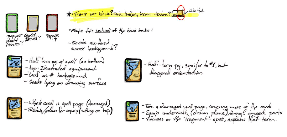
Since I’ve had the opportunity in the past to illustrate some Magic: the Gathering cards for Wizards of the Coast, I was lucky to be able to draw on that experience as well as a gamer’s hands-on knowledge of what works and what doesn’t (for me, at least) The idea is to have a clean, organized layout that’s functional for players (while still capturing the chaos that comes with the end of the world, of course). Let us know in the comments what you think of them so far.
It’ll be a while before packaging is a concern. But hey, I can’t resist thinking about what it could look like.
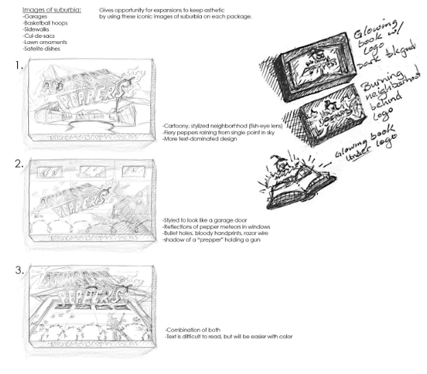
Since the box is the first impression the game makes on most people, there are some unique considerations that go into its design. Not only does it need to capture the game’s theme and vibe (communicating that at a glance) but if Doomsday Peppers ever sits on a store shelf, it’ll need to visually compete with game boxes around it.
I’ve swung all over the map on concepts for the box cover. From logo & type-focused (a), to a minimal theme representation (b), all the way to wholesale chaos, (c). At this early stage, I don’t want to get too tied to one, in case things change. So for now, I just keep pushing this to the back burner. Does one of these concepts really work for you? Can you think of any cover concepts you’re surprised aren’t here? Well, that’s the whole batch of Doomsday Peppers art as it stands now. I’ll be revisiting this topic as progress is made and new art is created. As always, leave your thoughts below or jump on our Discord server to let us know what you think!