Hello residents of Scoville! Today, I’m going to do something a little different. After the last (very verbose) entry, need a little break from all the words (and you probably do too). SO, instead of giving you another novel to read, I’m going to be sharing with you some of the art and design concepts for Doomsday Peppers.
Just to be clear, it’s early days for the artwork, and the time for uploading final art and sending it to the manufacturer is far, far away. Keeping that in mind, you’ll see that most of the art I share here is in the rough concept stage. …Some of it very rough. …As in, hardly more than thumbnails. My hope in showing them to you is to let you see where we are in the creative process of figuring out what Doomsday Peppers will look like. There’s a lot to show you, so I’ll split this into two blog entries, but the logical place to start is with the logo.
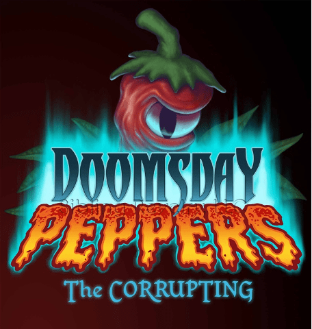
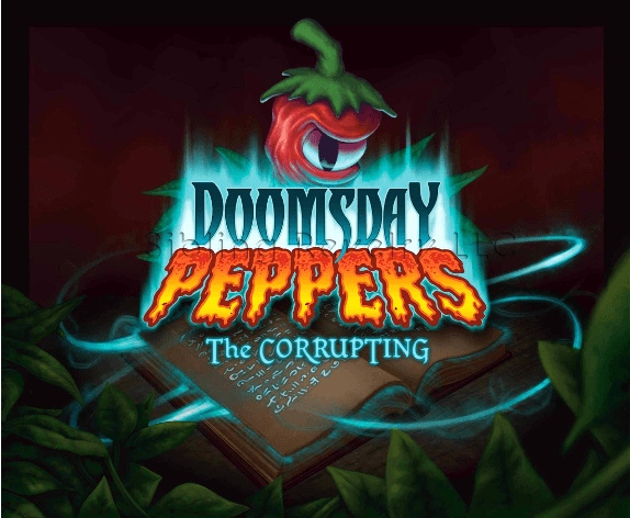
This, you’ve probably seen before (since you’re reading this blog, and all). It’s the official logo for the game, and as such, it’s the most complete piece at this point. It’s been through a few iterations while we’ve been developing the game, but I’m pretty happy with how it’s looking right now. Happy enough that I don’t want to change it again, so fingers crossed!
The whole idea behind the logo is to capture a campy, over-the-top handling of dark themes. In this case, the end of the world and evil magic. It also had to allude to the garden-ey theme that permeates the game, so I added the leaves, and the big giant pepper looming over the whole thing (the first appearance of that guy. More on him later).
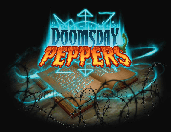
This is the “Hero Image” I originally put together as a showpiece for the landing page we set up a while back. Notice the magic-ey glyph symbol that’s since been removed (from the logo AND the game). In order to tell a little more about the story, and to pique people’s interest, I used the contrast of the spell book and the modern barbed wire.
Just as the game’s logo needed an update, so did the Hero Image. Here, you’ll see that the modern “survivalist” elements of camouflage and barbed wire are replaced with garden-themed imagery. This reflects the game’s moving away from a “survivalist” feel and looking more to the vegetable garden for themes & inspiration. I’ll stop here for now. Lord knows I could go on all day about the artwork, but I promised this one would be a bit of a break. Tune in next time for the second half of our look at the art of Doomsday Peppers (so far)! Just so I don’t make you wait TOO long, the second half will be posted in ONE WEEK. Come on back to check it out!